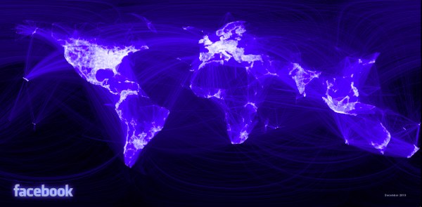
We already know that Facebook is huge, but now we have true visual feedback to how impressive the Facebook empire really stands. It is massive. And it is clear that all of Europe and the Eastern United States have too much time on their hands. But what is even more impressive is that the above picture isn’t actually wasn’t supposed to look like our world, but it does anyways.
Paul Butler, a Facebook intern who should clearly earn a job at the company, took a data set of over ten million friendship connections and plotted those connections to city points on essentially a black digital image canvas, and after tweaking with how the points and lines (which shows the connection) were displayed, the result was a stunning thing: a faint — albeit imperfect — replica of the Earth’s world map.
Butler was somewhat shocked with the whole thing:
I was a bit taken aback by what I saw. What started as a massive blob of data had turned into a surprisingly detailed map of the world. Not only were continents visible, certain international borders were apparent as well. What really struck me, though, was knowing that the lines didn’t represent coasts or rivers or political borders, but real human relationships.
If that isn’t impressive enough, be sure to check out the jumbo-sized version.


GIPHY App Key not set. Please check settings
One Comment