As Google celebrates the change of seasons with a newly enhanced layout, I’ve come down with a bad case of Springtime nostalgia. Ah, yes, the glory days of my pre-teen years bring back fond memories. But, like any good tech nerd, these memories don’t consist of playing in the sun or relaxing in the shade, but instead, of the wild, wild, west of the web.
The year is 1998. Everyone and their mom is planning their own website, and you’re looking to get in on the action. But, how? Easy, as any informed webmaster of our time knows, there are 13 critical components that define a great website. Allow me to explain…
1. Free Hosting With a Site Builder
First, you will need a free hosting account with a reputable, professional, top-of-the-line hosting provider like Geocities or Tripod. Really, any service that will host your files and provide you with an easy-to-use site-building interface will do. Most importantly, make sure you base your decision upon which company’s name you think sounds the coolest.
2. The Perfect Pseudonym
If you want your website to be taken seriously, you’re going to need to build a solid reputation. Of course, that all starts with the perfect pseudonym. David Davidson may work for you in real life, but you’re going to need something a little more powerful for your online persona. Try viRu$_hAx0r_4002-91, CYBER_BATMAN_2000, or sk8r325809238291. See, doesn’t that feel better?
3. An Under Construction Page

What’s more important than actually launching your site? Taking the time to create an elaborate page letting anyone who may randomly stumble upon your site know that it’s under construction. Do not, I repeat, DO NOT begin working on your site until you have a solid “under construction” page up. Don’t forget to include several images of construction signs and links to websites that already feature the content you are planning to cover. This might take awhile, but don’t worry, this page can be saved for future use.
4. An Extravagant Wallpaper
When building your main index page, you’ll want to start with the most important element — the background. Why is this the most important thing to focus on? The background accounts for the majority of any given visitor’s monitor space. Keeping in mind just how important the background is, you’re going to want the flashiest wallpaper available to plaster on it. Good choices typically include camouflage and tie dye. Really, though, any multi-colored pattern works. Don’t worry if you can only come up with a small image, you’re going to want to tile it anyway. That way, your 100px by 100px image will be shown hundreds of times.
5. Quality Content in Varied Fonts
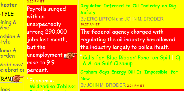
Filling your website with quality content is the easiest part of the website creation process. Simply speak your mind and load your site with information on any topic that interests you. Feeling lazy? Not a problem! Just find websites that already contain the information your site needs, copy it, and paste it into your site editor. Easy, right? Now, you’re not going to want it displayed in some boring font like Arial or Times New Roman. Select a font that gives your site some character, but make sure to switch it up every few paragraphs or so.
6. URL Redirection
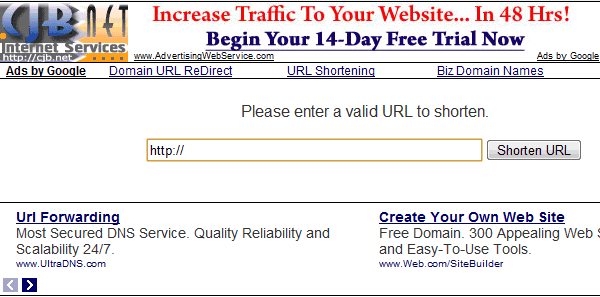
Sites created with Geocities and Tripod have long, hard to remember URLs. You’ll want to use a service that gives you a shorter URL which redirects to your page like CJB.net. This will ensure that you don’t forget your site’s address. As an added benefit, it will help your friends to access your site more easily. Don’t worry about the pop-up ads it will activate, this too makes your site look more professional.
7. The Enter Page

When visitors land on your site, you don’t want them to immediately receive the content they are looking for. Why? That makes you look like a total newb. Instead, you’ll want to create a splash page with a link that reads “enter.” Essentially, this is the online equivalent of opening your front door and inviting a guest into your home.
8. A Guestbook

Alright, you’ve spent a lot of time creating a solid website, now it’s time to enjoy the fruit of your labor. Installing a guestbook on your site is as easy as registering at Bravenet.com and customizing a pre-set template. After doing so, you can stick it right onto your site. Always include the field “What do you like about my site?” in the guestbook form — your hard work should never go unnoticed.
9. Buttons (Lots of Them)
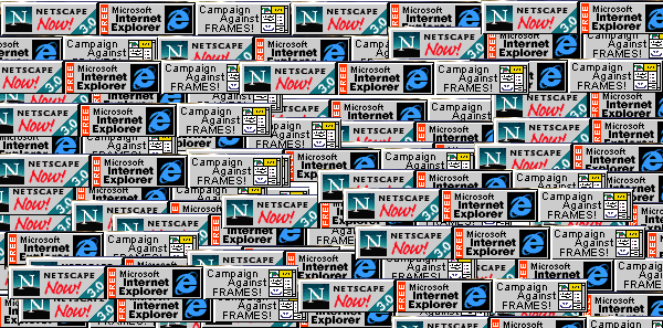
Seek out a number of websites that rank the top websites for any given category (i.e. Top 100 Freestyle Frisbee Websites). Submit your link to them and you’ll be given a nifty button to place on your page, letting everyone know that you’re aiming for #1. The theme of these ranking sites is irrelevant, if your website is good, it will make it to the top of their list. Among these buttons you’ll also want to include buttons that send users to download Netscape Navigator and Internet Explorer (just in case they don’t already have a web browser).
10. A Welcome Pop-up

While the enter page invites your visitors into your site, you don’t want to forget to welcome them. If you forget to do so, you will come off as rude. You don’t want that, right? Of course not! The best way to welcome visitors to your site is by creating a box that pops up and reads, “WELCOME!!!!!11.” If they have their speakers on it will make a loud noise alerting them of your greeting. Visitors will also have to click the “OK” button in the pop-up ensuring that they have received your courteous welcome.
11. A Visitor Counter
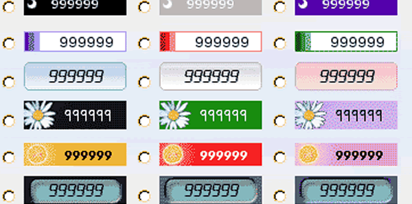
Every high quality website has a visitor counter that tracks how many times any given page on a site has been viewed. This will let you know how many individuals around the world are visiting your website, and will update in real time. Don’t feel bad if you’re not getting a ton of traffic, most counters allow you to start counting at any number you please. It’s recommended that you set your counter at a few million views to start — this will make your site look extremely popular.
12. Animated GIFs
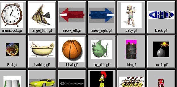
The number of animated GIFs your website contains is directly proportional to its value. Stick an assortment of these images in seemingly random places throughout your pages. Popular animations include: flaming skulls, rotating smiley faces, large bouncing arrows, and pointing fingers.
13. A Looping MIDI Song

Adding a looping MIDI song to your website is the icing on the cake. First, select a popular (preferably alternative rock) song. Next, find a MIDI version of the song using a reliable search engine such as AltaVista and download it. No, this is not illegal, artists don’t care how their music is used on the internet. Patiently wait as the download may take between 2 – 3 hours depending on how many people are connected to your ISP at the time. Once completed, embed a MIDI player into your site, set the loop to infinite and you’re set. Now your audience can jam out to your favorite songs while they take in the awesomeness of your site.

Good list, but I’m still amazed at how many “professionally designed” websites still have the visitor counter, the “click here to enter” welcome page and auto start audio files.
Sometimes no amount of statistics, background information, and, oh yeah, professional experience…will make it possible to talk a client out of a splash page. I’ve only had the one client so far who has refused to budge on this and whilst I did give in… I still advise to remove it whenever we walk through the analytics!
Belinda is right. Most web designers, talented or beginning, know how ridiculous this is, but clients want this and nothing else. I wonder if they also dismiss their architects’ advice when they want to put a kitchen on the third floor.
I’m guilty. I used to have a webpage on geocities utilizing all 13 components listed above. That and namezero, which gave free .coms. We all have to start somewhere, right? 😛
You forgot the marquee (preferably blinking) and the mouse cursor trail. Those are also of grave importance to your online presence.
Yeah! That’s truth… I’m guilty… :S
Oh! We mustn’t forget those. They made sure that users paid attention to the most important text on your site, like some random lyrics! 😉
Visitor counters, everybody loved them somehow…
You forgot one important thing: the all important, “Best Viewed in Netscape at 1024×768” icon, or similar.
AXEL F. !!!!! 😀
Haha, great article. 🙂
All the coolest websites in 2010 had a place at the bottom for people to post comments.
Haha, true that! Also, your website must have a Share This – button, which opens a javascript box with millions of social networking services. And you must also use a “Digg counter” which shows how many ppl have clicked a button on your site, to show the readers how popular you are 😀
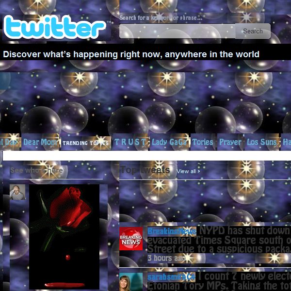
Haha! And don’t forget the essential right hand twitter feed, so everyone can read your clever updates and remarks..
I think twitter and social networks were not around in 98?
::::: hanging head in shame :::::
Some painful memories there 😀
I have a proposal for a new article: “13 Components That Defined a Great Website in 2020” 🙂
Great work! Thanks!
#11 Visitor Counter
I still see this in websites today lol .
You forgot about being part of a Webring and the secret link to access your own awesome fanpage 🙂
I thought there for a moment you described websites designed in Thailand in 2010…
oh that is so cold lolz
speaking of which!
I practically puked from my eyeballs when I saw it… lol! thats your practice page right?
This is how websites are still made in Japan in 2010.
Very good!
I find the sense of superiority that is laced throughout this commentary, as if the current crop of web design philosophies was somehow objectively better than what was being done 10 years ago. It is not. It is merely the latest manifestation of whatever is ‘hot,’ combined with a slicker image/appearance.
PSA: In 10 years, what we are doing now will be similarly (and similarly misguidedly) mocked. Rinse and repeat.
Haha epic! You forgot the obligatory ghost town chat room and ROTATING gif images!
Classic!
Wow, incredible. Gotta love those 90s!
Lou
http://www.anon-vpn.cz.tc
Haha been guilty of a few of those in the past!
Love the 2 minute long entry “intro”.. did anyone but the client actually sit through those? lol ;-P
Undoubtedly, there are still web pages with those features.
Don’t forget about the flaming, rotating, 3D logo! Nothing looks more professional than that! Unless you count a animated rainbow banner. Those are sweet too!
I lol’d.
Gosh 🙂 This is a brilliant list. However, as Salival also said that, the marquee texts (of any direction) are missing.
Wow!
Really true …. Must use geocities if not, no one will acknowledge your websites… Haha 😛 lol!
i really enjoyed the post — funny how these little things take you right back — keep up the good work!
Wow.
this collection of information is a revision of web history..
thanks for providing such a information….
100×100 pixel tiles were way too big back in the day. Most tile background images were about 40×40, if you were lucky you could use a 50×50 one, but at dial up speed you didnt want to spend another 10 seconds downloading it 😀
Hahaha.. that’s a cool retro 😛
While it’s obvious that those ‘components’ are now very much out-dated, I don’t think we have to laugh or mock at them. Because anyhow many of us started that way because at ‘That’ time, it was the trend.
I think it is a good one to think about the differences between those two different era (?) and see why now these things will not make much sense.
//K_Wasseem
(7php.com)
Haha you made my day timothy! Good work.
Funny timing. I had someone ask me to put a counter on a site a couple of weeks ago. Showed him how to access the Analytics account I had setup when I built the site. Think he was a touch overwhelmed.
Still see music and welcome pages way too often. Either one gets me looking for a back button.
what about the markup? td tr t whatever? haha. . .wooohooo thanks to the divs and css… but i do wonder 10 years from now? will we laugh at how websites were done in this era? Thoughts to ponder my fellow apprentices of the web design force…
I’m afraid you’re absolutely right, It’s exactly how was my first website created in 1997. It’s weired, I mean it was only 13 years ago but every of these stupid things seem to be so so far away from the web of today! Thanks for this little moment of nostalgia!!
Really in those days the websites were of that type, reminded…
It’s amazing to see how web design has changed since 1998.
Yep it’s still alive and well
…and the everlasting snowflakes
Ah nostalgia… What a great list ! I lol’d
And why be simply professional when you can be awesome ? Add seizure inducing blinkies , marquees everywhere , broken code is mandatory . You’ll be remebered forever
Funny to see that some of these are still made to this date .
Thinking , maybe in 10 years , our current pratices will be mocked as well .
Its always fun to run across a newer website that uses things like these right out of the 90’s.
Hahahahahahhha
they are very nostalgic :lol
What about the javascript “analogue” clock which encircled and followed the mouse pointer? Absolutely essential!
wow, thanks so much for the memories! i am guilty of a few of these back in the day as well. what fun to go back and see how far we’ve come! where will we be in another 12 years?? i can hardly imagine!
“Select a font that gives your site some character, but make sure to switch it up every few paragraphs or so.”
-This made me spit up my DP.
The article reminds me of Logodesign’s “7 Secrets to a Perfect Logo” they did a few years back. Hilarious.
Who’d have thought. Twitter brings back the wallpaper… And Facebook revives the counter!
BEST. POST. EVER!!! I feel like we’re forgetting something though… I just cant’ put my finger on it!
Well, apart from the Welcome popup, I did it all, only it was 1999 😀
LoL – hilarious
This really could have been titled: “13 Components That Defined a Great Website in 1998 or a Great MySpace page in 2008”
I miss the days of downloading split zip files of a pirate photoshop 4 off multiple geocities accounts.
Piracy is much easier now.
I totally did everyone of those. I had one of the coolest geocities page’s ever. Had an awesome marquee on there as well…I do miss those days.
yeah, me too… and yes, I had a marquee as well =) good times!
Its amazing how far away 1998 is in the tech world, the changes that have been made are very significant, and its strange how “old fashioned” it all looks, Welcome popups what kind of dumb idea was that
yes! I admit it! I am one of those who used autoplay midi files, animated gifs everywhere and tiling backgrounds, and yes I used Geocities to host it and CJB to shorten it… But I was 13-14 years old back then!
How about the trail of words that followed your mouse around. I ran into that just the other day.
In 2020 if you do the same analysis you should put twitter, facebook and RSS buttons :p
Ah the days of Geocities and Tripod! You missed one thing though…
The wee mailbox with the wee opening flappy bit and the envelope flying into (our out of) it.
Whenever a client asks for a splash page I tell them that someone will die as a result of it. Even worse, a splash page in Flash!
lol! Great posting.
I also made a website in the 90s… but it didn’t had images at all. The very first Version looked like this: (I was 13 years old at the time)
One Year later I added some colors and the legendary counter 😀
Today i’m running a WordPress, it’s much easier.
very amusing.. even if I was too young in 1998 to remember all this crazy stuff, I can recall tons of GIFs all over the web.
I would have enjoyed a linklist to 1998-sites that are still online
I remember being in 5th grade when I was taught how to make my own webpage. It wasn’t hosted by Geocities (though I do remember those fondly), but was connected to my school’s main website. I can’t even remember what program my class used to code and build our pages. We would go to rogersgifs.net (or .com, which ever) to decorate our pages and then on to another site that let us create our own scrolling/bouncing/crazy text banners.
*sighs in nostalgia* If only I could see my old site again…
If it was online, it may have been archived by the Wayback Machine web.archive.org – I found a few of my websites from the late 90s and early 00s. Embarrassing, but sort of cool at the same time.
Why NOT lol a bit about the clunky tools and user-unfriendly ideas we had in the day?
I had a good laugh about this post! As an Actionscript developer, you might wish to list the mandatory Flash intro. Don’t forget to mention it must take at least two minutes to finish! A ‘skip intro’ button is fine, but make sure it doesn’t get in the way of your aesthetic creativity.
Oh the glory days of Angelfire (if you have no clue what Angelifre is than that makes me seem old even though I’m not) and shortening with cjb.net. Good Times. The only time I used an editor to design a page, hence the ‘page’ was back in like ’97-’98 and I was in 7th or 8th grade, sorry its been a while. It was expage.com I think, don’t quote me on that. I thought it was so cool that I designed my own web page. Only after that did I move to Angelfire and learned html to design sites hence ‘sites’. I remember the days of throwing a whole site together in less than 5 hours with frames, tables, and really bad colors. Can’t forget the comic sans ms font all over the place. Memories…..
great post
Hey nice article !!
I would be curious to read the same type of article in 10 years, like “how 2010 trends sucked”, will be funny to see the evolution 🙂
This. made. my. day. This is seriously the best blog post I have read in ages. I have been through every one of these phases, oh the lulz and the memories.
Haha. That was a nice post 😀
Maybe in 10 years CSS3(.1) and HTML5(.1) are standards… LOL who knows?
I had an out loud fight with my boss on why i refused to put an animated .gif on the homepage!
If your scrollbars werent a different color you failed at web design.
Too true! I admit, though, that I actually miss those. When a good colour scheme was used that blended in with the website’s design, it looked really nice…
That is FUNNY! and TRUE! 🙂
I do remember using the stupid button idea and a free domain name from Yahoo 🙂
XD… so true!
F34r the power of old sites!
Lol!
Reminds me of the first website I created. 😀
naked truth
This really takes me back. And literally to 1997-98! GeoCities, Tripod, Angelfire, Brinkster, cjb.net, AOL hometown even. Visitor counters? Check. Ugly, tiling backgrounds? Check. Animated GIF or two? Check. Frames? Check.
Ahhh, nostalgia! I had my first website as a MSN “Group” when I was 12. Every page had a different background colour and font. It transformed into a Tripod site within a year or so, with (most) of those essential componants included. Eventually I ended up on the subdomain of my mom’s website, when I was about 14. Crazy thing is, though, that it was actually getting thousands of hits a day. I’d know this because of that awesome Bravenet counter that I had. 😉
Great post, thank you! Takes me back to my first site, when my homepage link was a little clipart picture of a house at the bottom of each page.
Great memories! At least before, web sites was not all the same and more creative, now there are just copy/paste of templates, soulless .. so sad ;-(
You also forgot the marquee and blink tags 😉
The 66-year-old Garrett has been the Trojans’ athletic director for 17 years, but he received caustic criticism for his handling of USC’s scandals. The school didn’t say whether Garrett retired or had been fired.
Both Garrett and Haden are former USC football players. Garrett won the Heisman Trophy in 1965, while Haden was the Trojans’ starting quarterback for three years in the 1970s under coach John McKay.
🙂 Really true list.
This is a riot. I had a site like this once. The scary part is that a lot of people who will see this post (like my kids and their friends) won’t get the joke. It sucks to get old……
Hilarious! As many have stated here, I too was guilty of having such a site in the old GeoCities!! Ahh, memories…..
this reminds me of my high school internet and webpage design class
Wow, I remember those days.
Wow, this reminded me of when I was growing up and when my friends and I would built websites on Geocities. I pretty much did all of the things you listed above.
amazingly so true!
Good old times.
These are really cool! By using all these great components, one can build a great site! Thanks for sharing.
Great article… My personal favorites are the rainbow headers (where each letter is a different colour) and text that flashes.
Things I have done 5 years ago… :)).. nice list…
This somehow makes me feel nostalgic even though I contemplate homicide whenever I run into a website that still implements even one of these things.
poor memory