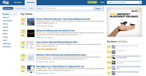
Regular readers of Techi know that we love Digg and that, most of the time anyway, Digg loves us.
So when Digg rolled out version 4 of its social aggregation site – or v4 as many have called it – many, including us, were excited, particularly because there have been rumors of Digg’s waning influence. The refresh promised to not only reinvigorate the platform, but also make it competitive with the massive influence of Facebook and increasing presence of Twitter.
Alas, not all is well with the new Digg. In fact, many people are downright angry at some of the changes and flaws with the new site. Complaints range from the design to changed functions. But not everything about the new site is bad, however; quite to the contrary, some of it is excellent.
We separate what new changes we like – and what Digg needs to change ASAP.
Things Digg Needs To Fix
Bugs. Like, Lots of Them
All new iterations of websites have problems. Unfortunately, for a site as high-profile as Digg, the amount of bugs the site is currently displaying is simply unacceptable.
Currently, comments either aren’t appearing correctly or are appearing sporadically. Links to sites sometimes work and sometimes don’t, particularly internal links for other mentions by that site. Search is borked. Digg buttons across the web are broken. And to top it all off, the site sometimes decides to just not load.
These are core functions of Digg, and unless the site fixes them soon, they may lose users to competition already breathing down their neck.
Resurrect Bury
Did you get it? ‘Resurrect’?! Ah, nevermind…
Anyway – the new version of Digg has done away with ‘burying’, which allowed users to down-vote articles they either didn’t like or felt were suspect. But more generally, burying performed two functions: a) it was a kind of filter for pieces that would appeal only to particular people – such as highly anti- or pro-Apple stories – that would rise to the front page of Digg quickly, but maybe didn’t belong there; b) it was also a countermeasure for articles with sensationalist headlines that would get voted up quickly, but that upon reading, were found to be lacking in substance.
By getting rid of ‘Bury’, Digg has lost a powerful tool for balancing the kind of content that shows up there – which was one of the reasons for the redesign in the first place. Bring it back, Digg.
Respect Users’ Habits
As Facebook has shown, changing the user interface – even when for the better – can provoke massive user outrage, whether justified or not.
But by eschewing really basic things like a thumbs-up and thumbs-down button and the upcoming section, Digg seems to be ignoring some fundamental aspects of both its identity and the habits its dedicated users have developed over years. Changes that make things better are always welcome. Changes like these on the other hand, may have actually made things worse.
What The New Digg Does Right

Design
Some people hate the new design, but the simplified look of Digg with a column of categories on the left is unarguably much cleaner and, I’d venture, a welcome improvement from the cluttered mess of the Digg of yesterday.
The font is also clear and readable and the whole site just now seems easier on the eyes.
Overall, the new design is more logically laid out and less distracting and intrusive.
Social Personalization
While ‘social personalization’ sounds like the kind of web buzz-phrase that makes you want to stab yourself in the eye, the personalized aspect of Digg is actually pretty great. Though the holy grail of the ‘personally curated news site’ still feels like it’s a way off, the new Digg does a decent job of displaying news that’s relevant to you because it’s based on who and which organizations you follow. Be a bit careful about who you follow and it would be easy to get a constantly updated stream of news customized for you – without the cat pics and lunch descriptions you get on Twitter and Facebook.
Robbing Power Users of Their Power
Many Digg power users are complaining that they cannot perform more than 50 actions an hour.
Well, to them I say: tough.
For too long now, Digg has been plagued by a few power users who, through sheer commitment of time, are able to influence the site disproportionately. It was this imbalance that was behind the recent scandal in which Digg was gamed. By instituting new rules limiting how much an individual can participate, Digg will be closer to its original intent: a reflection of what people are reading on the web.
What do you think of the new Digg? What would you change and what you would keep?


People who are interested in the new Digg may also be interested in quippd — a collaboratively edited social news site that works a lot like Digg4 (we were out before they were!) but adds some more wrinkles to the experience.
Check it out at: